The Language of Color in Portraits
When we choose what to wear for a photoshoot, we’re not only choosing clothes – we’re choosing energy. And energy lays not only in silhouette but in colors as well. Let`s talk a little bit about that. I think it can be helpful during preparation before photo session.
Every color carries a vibration that reflects where we are in life. Some tones protect us, others reveal us. Together, they tell the story of our inner season.

For example:
Black – control. It holds gravity, independence, and strength . Black color often chosen by those who wish to stay in charge of what the world can see. We can say that black is like an armour for the soul.
White – vulnerability in its purest form. It suggests new beginnings, the search for clarity, and the courage to appear open and unguarded. In portraits, it reflects light beautifully and symbolizes emotional renewal.
Blue – connects to depth and introspection. It’s the color of inner peace and often chosen by those who think and feel deeply, who value truth and calm over noise.
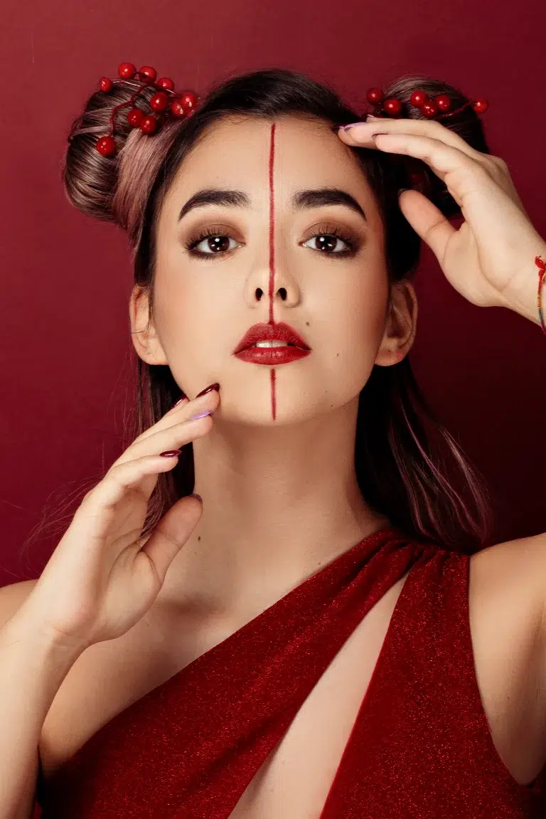
Red – pure life force , passion, drive, courage, and presence. It’s the heartbeat of transformation. Some people resist wearing red because it feels too visible, but when they do, it often marks a moment of reclaiming their power.
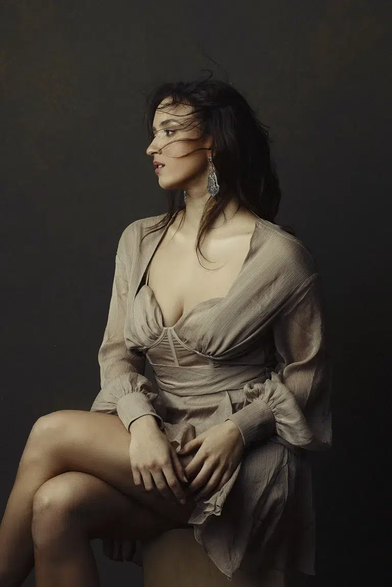
Grey – lives between worlds. It represents reflection, balance, and self-awareness. In portraits, it brings quiet elegance and neutrality and letting your gaze take the lead.
Purple – carries a different vibration. It belongs to imagination and sensitivity — a bridge between the emotional and the spiritual. It’s chosen by those who feel deeply and wish to express their inner world softly, not loudly.
Orange – warmth and vitality. It carries the joy of movement and creativity , a color of confidence, spontaneity, and connection to the senses. It celebrates the body, laughter, and living fully in the moment.
Green – renewal and balance. It’s the color of healing and growth , a reminder that we’re part of nature’s rhythm, constantly evolving and finding our way back to center. In portraits, it often feels calm, grounded, and alive.
And then there are pastel tones – the colors of tenderness.
Pastels often appear when we enter a gentler phase of life – when we allow softness, acceptance, and recovery.
Among them, pink holds a special place – it reflects compassion, self-love, and emotional gentleness.

These hues are like an exhale after long intensity – the space where calm and openness return.
We often know instinctively which colors look good on us – and that’s a beautiful start.
But color doesn’t only enhance appearance – it amplifies meaning.
A well-chosen tone can bring light to your skin, but also light to your story.
It can soften, empower, or reveal.
That’s why the real question is not only “What suits me?” but also “What speaks for me?”
When preparing for your session, I always recommend avoiding strong patterns or busy textures – they distract from what truly matters: your presence.
When color is simple, emotion becomes visible. But take a note on patterns:
While I usually recommend avoiding bold or distracting patterns – especially those with high contrast – that doesn’t mean patterns are off-limits.
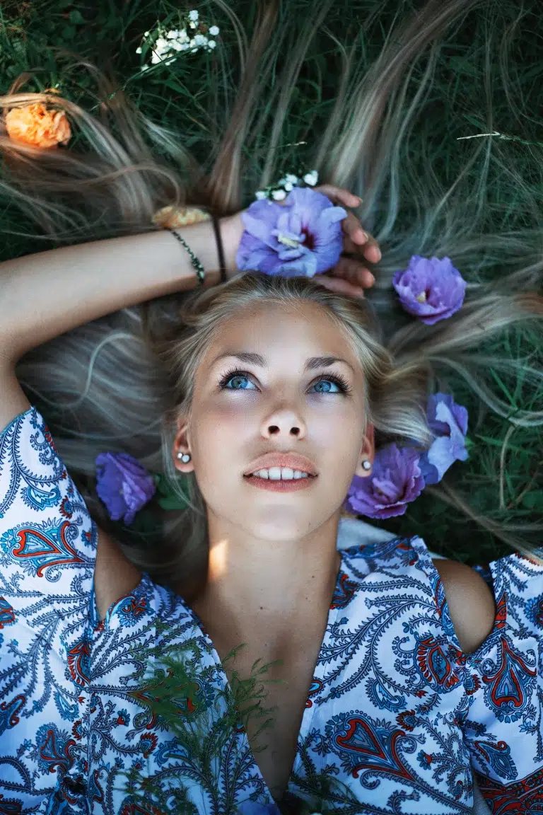
Some fabrics tell a story of their own: delicate florals can whisper nostalgia, subtle stripes can suggest structure, and cultural prints can carry deep personal meaning.
If a pattern feels aligned with your personality or phase of life, and doesn’t overpower your presence – it might be exactly what your portrait needs.
As always, let intuition guide you.
Sometimes clients ask whether there’s a “right” palette or color type to follow.
I’m not a color analyst – and you don’t need to be.
But if you’re curious, color analysis can be a beautiful tool. A seasonal palette, based on your skin tone, eye and hair color , can help you discover tones that naturally harmonize with you.
For example, someone with cool undertones and light features might shine in soft summer hues like dusty rose or muted lavender , while a person with warm golden tones might come alive in autumnal rusts or olive greens.
If You feel the need You can always consult a stylist or color specialist before your session – someone who can help you find tones that complement your natural features and personality.
But often, your intuition already knows.
Photography, at its heart, isn’t about fashion – it’s about feeling.
The hues you choose reveal how you move through your story right now
So before your session, take a quiet moment and ask yourself:
What color feels like truth today?


Alena Massen
I am a portrait photographer drawn to truth, emotions, and transformation. My work focuses on women — their strength, their stories, and revealing a beauty that isn’t defined by age or shape, but by inner harmony and honest presence. I believe in the power of portraiture to connect us to ourselves and each other. Whether through symbolic storytelling or minimalist intimacy, my goal is always the same: to see and help others feel seen and truly accepted by themselves.
